This article is written for all readers, Year 9 students through elder adults. Methods and reasoning herein are pedestrian. Doctors and scientists may opt to skip to “BEGIN HERE TO VIEW DATA”. If you really want to cheat, skip to the bottom and look for yellow highlighted cells in spreadsheets. Understand what they represent. They represent significant, proven, excess death in the circulatory system matching what the pharmaceutical companies and governments call “rare”, another word seemingly redefined in 2021.
The official Massachusetts database of death certificates contains proof that C19 “vaccines” killed thousands of people in Massachusetts in 2021.
This article details a forensic journey in a one-of-a-kind, brute-force, pedestrian, forensic analysis of the official Massachusetts government data to discover what happened and is happening in a population of ~ 6.9 million people at the fore of C19 “science.” Massachusetts is a leading medical and pharmaceutical technology exporter to the world. Some leaders say it is a model for C19 response planning. The truth is that Massachusetts is a model for fraud on the people.
As demonstrated in particularity below, there was a short pandemic of respiratory deaths in 2020. Then, in the year of injections en masse, deaths switched to mainly circulatory system deaths. Something is attacking the circulatory systems of citizens of Massachusetts.
Three main events are initially depicted: a pandemic, an extremely attenuated second wave of disease no longer a pandemic, and a nearly steady-state excess death anomaly in the second half of 2021 (likely began around February 2021, but was obscured by lower than normal deaths of 85+yo’s due to culling from C19 in spring 2020).
Investigation of the anomaly indicates that excess deaths are circulatory system involved, also known and documented in the C19 vaccine trial data. Though myocarditis gets the most notoriety, the entire circulatory system is under attack.
Hereinafter, the C19 “vaccine” will be called “gene modification” because it is a more accurate descriptor of the biological injectable product. Industry and government chose “vaccine” because it is more psychologically acceptable to consumers. “Vaccine” has product-class recognition and reputation. Ergo, the definition of “vaccine” was changed in 2020 to accommodate the inclusion of C19 gene modification into this product-class. Lawsuits based on this issue of “definition” are pending.
EUA WARNING
It is an undeniable fact that the Emergency Use Authorization (EUA) for the C19 gene modification circumvented the normal course of years-long clinical trials that ensure safety and effectiveness of oral and injectable biological and pharmaceutical products.
Through the EUA, which granted immunity from tort to the manufacturers, the burden of precautions (clinical trials) was shifted from the least cost avoider (the manufacturer) to the most cost avoider (the consumer). Though the burden of precautions is pecuniary to the manufacturer, it entails loss of life to the consumer. Id est, pharmaceutical manufacturers avoid costs and increase profits, while consumers die or are maimed after assuming the burden of precautions as lab rats.
INTRODUCTION
Scientists disagree whether the C19 gene modification's spike protein or its lipid nanoparticle is the root cause of injury or death in a minority of people (a death lottery). Either or both theories are in harmony with this article’s conclusion.
To preemptively assuage decriers of “correlation does not equal causation,” this poignant allegory is offered. If five strong swimmers died in one month in a busy lake, would you: A) close the lake to swimmers pending results of investigation, or B) leave the lake open as a small percentage of swimmers continue to die during investigation? Regarding C19 gene modification, governments chose “B”.
While others start at the lowest level of abstraction (cellular & molecular) and then look upward to localized and systemic injuries in an effort to establish a causal chain, this article starts at the highest level of abstraction (all-cause deaths), then investigates downward into anomalies. 1) Is there an anomaly in all-cause deaths? If so, 2) Whom did the anomaly affect, and when? 3) How did the anomaly manifest in immediate and underlying causes? 4) Are the underlying causes traced to the C19 gene modification as a root cause?
METHODS
Many authors use expert terminology from statistics or science purviews, which makes research papers difficult for the pedestrian to understand. This article is for a broad readership. Confidence intervals, p-values, and box and whisker plots are not used. Simple methods and visual depictions prevail herein.
The intent is to find causes of excess deaths by investigating and depicting anomalies arising from a difference between actual and expected numbers of deaths. Actual values are obtained from the official Massachusetts Department of Public Health (MA DPH) death certificate database (“the database”). Expected values are mathematically derived by AVERAGE method or TREND method. Differences are depicted in ways assumed to best impart understanding to all levels of reader.
AVERAGE method
Obtain from the database the actual number of deaths in a category for each of years 2015-2019. The AVERAGE of those numbers is the expected value for years 2020 and 2021. (Not good for significantly positive or negative trending datasets.)
TREND method
This method is a little more complicated mathematically. Simply envisage a straight line that best estimates the five 2015-2019 datapoints on a graph. The 2020 and 2021 expected values by TREND method would be an extension of that 2015-2019 line. For the math hounds, the TREND method in this article uses the least squares method embedded within spreadsheet functions SLOPE and INTERCEPT.
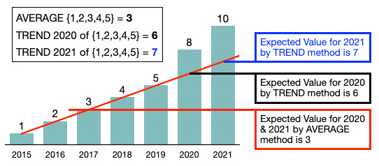
METHOD COMPARISON GRAPH
The above graph demonstrates clearly the disadvantage of using AVERAGE method to predict future results when there is a clear trend in the data. Year 2020 at 8 is 33% greater than the expected value of 6 by TREND method and 167% greater than the expected value by AVERAGE method. This is why both will be offered in the analysis after the anomalies are discovered and investigated. Every attempt is made to be open and honest despite obvious author bias. Every author has a conflict of interest despite claims to the contrary (topic of an article forthcoming).
DIFFERENCE depictions
Line charts present well for large datasets, while bar charts are better for small datasets. Daily deaths over a year’s span are depicted as line graphs, sometimes smoothed with 7-day averaging. Graphs of annual totals for years 2015-2021 (only 7 datapoints) are depicted using bar charts.
Difference depictions are shown in three different ways: 1) raw number differences, 2) percentage differences, or 3) standard deviations from mean. Each has unique benefits and drawbacks. Used are line graphs, bar charts, and spreadsheet heat maps.
ISSUES with methods
Statisticians and scientists can manipulate pedestrian readers through framing of numbers by avoiding relevant context. Datasets can be low in values, low in difference, low in elements (datapoints) or other type of nuance that makes results appear better or worse. “Framing” data has occurred throughout the C19 dramademic. Visual depictions of raw data are simple and true.
Example of “Framing”: Cause-of-death XYZ
Quantity of deaths in 2015-2021: {2,1,0,0,2,0,3}
Mean = 1.00
Standard Deviation = 1.00
2020 is 100% below average
2021 is 200% above average
Some would report, “XYZ Deaths Up 200% in 2021.” Though true-in-fact, this is ethically dishonest and manipulative. Yet this type of deceit by omission of context has become commonplace among authors and scientists throughout this portentous pervasive perversion of epidemiology. As a pedestrian reader, look again at the dataset. There is very little that can be concluded from it.
WorldoMeters.info, ourworldindata.org, the CDC, Johns Hopkins, and the WHO derive their data from governments. They omit important information and control the ability to cross-analyze for cause, fraud, and demographic differences. The database used herein is a root-source, official database and has all the details enabling multi-variable sorting and filtering.
Examples of fraudulent C19 listed deaths from the database:
Year 2020; SFN 26429; Immediate CoD = ACUTE FENTANYL INTOXICATION
Year 2020; SFN 32725; Immediate CoD = ACUTE FENTANYL AND ETHANOL INTOXICATION
Year 2020; SFN 48411; Immediate CoD = ACUTE METHAMPHETAMINE INTOXICATION
Year 2020; SFN 30639; Immediate CoD = COMPLICATIONS, INCLUDING COVID-19, OF BLUNT FORCE INJURIES; INJRY_L = PASSENGER IN MULTI-VEHICLE COLLISION
Year 2020; SFN 61665; Immediate CoD = Year 2020; SFN 48411; Immediate CoD = ACUTE INTOXICATION DUE TO THE COMBINED EFFECTS OF; Underlying CoD = COCAINE AND FENTANYL; CONDII = COVID-19 POSITIVE
Hundreds of these seemingly fraudulent “COVID-19” deaths were discovered in minutes using the database. There are likely several thousand more. The original recipient of the database requested an update since Massachusetts recently announced that more than 4,000 deaths were somehow mislabeled or mis-categorized as “COVID-19”. Fraud is the topic of a forthcoming article and includes not only listing deaths as being caused by “COVID-19”, but also includes deaths caused by the C19 gene modification listed without ever mentioning the injection.
Returning to the investigation …
IS THERE AN ANOMALY?
The first step is to look at all-cause deaths for all 7 years.
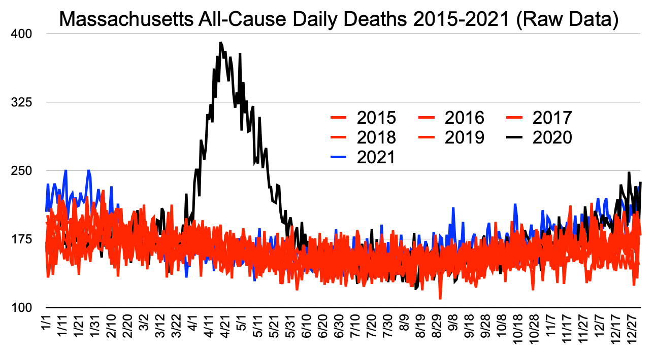
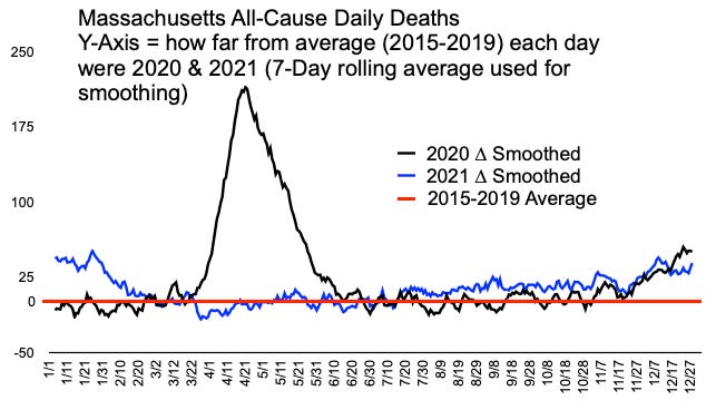
Graph 1
Visual Inspection (Graph 1)
Years 2015-2019 in red demonstrate the normal range of deaths in this 5-year period. This is raw data on a daily basis. No framing math trickery was used. The 2020 black and 2021 blue lines are visible in locations outside the red range.
Obviously, there was a pandemic from mid-March 2020 to mid-June 2020 perfectly resembling a high R0 Gompertz model, like most highly transmissible diseases. Then, 2020 black disappears into the normal red range with a few dots below the normal red range.
In November, 2020 black emerges above the red in an attenuated second wave of disease, again perfectly behaving to Gompertz models. Natural immunity gained from exposure was conferred on the majority of the population whether they knew it or not. That served to create a much lower second wave R0.
Black then turns to blue in 2021. At the beginning of the year, 2021 blue is visible for another 5 weeks before disappearing again down into the normal red range. The attenuated little winter wave 2020/2021 arguably should not even be considered a pandemic, but rather a bad flu-like year. C19 as a pandemic was truly over in Massachusetts June 2020.
From around mid-August to the end of the year, 2021 blue appears consistently above the red. This is concerning and does not appear to be the shape of a Gompertz curve, but it is difficult to tell from this graph.
Graph Summary (Graph 1)
There was a 10-week pandemic in Massachusetts March-June 2020, a smaller wave in the 2020/2021 winter, and some type of anomaly from August 2021 through the end of the year.
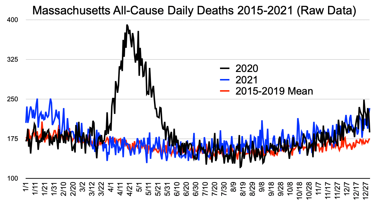
Graph 2
Visual Inspection (Graph 2)
Years 2015-2019 are reduced to a red line representing the daily average of 2015-2019 deaths.
The first and second waves are even more apparent.
The 2021 blue is very aligned with average normal red from February to about mid-July. And it is clearer that 2021 blue is well above average normal red from July 2021 through the end of the year. Notice also that 2021 blue July-November is well above 2020 black, which was the pandemic year. Then 2021 blue joins 2020 black in what appears to be a new wave in late 2021 similar to late 2020, though C19 should not be doing this. This is neither normal, nor disease-shaped. From July 2021 through end of December 2021 is an anomaly.
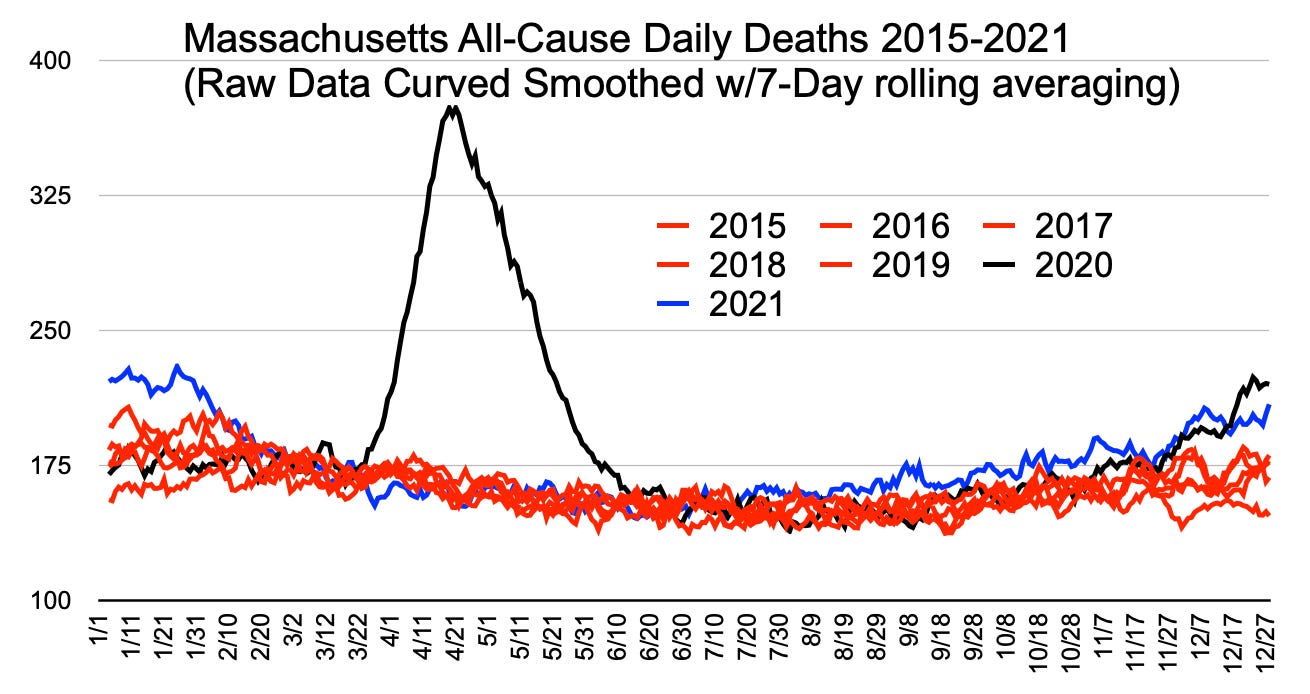
Graph 3
Visual Inspection (Graph 3)
Similar to Graph 1, but the curves have been smoothed using 7-day rolling averaging. The picture is clearer that 2021 blue is in a steady state above all other years, including 2020, from July 2021 through November 2021. The February 2021 blue backside of the wave shows another possible anomaly in that it starts down for 3 weeks and then goes up again. This anomaly will be left for another article. There’s too much here to pursue for one article. It is believed to be aligned with the second dose given to all the long term care facility residents and workers.
Graph 4
Visual Inspection (Graph 4)
Graph 4 is another clean-up method of simply taking the difference between the 2015-2019 average on each day and the target years 2020 and 2021. The set of differences was then curve-smoothed. It is now very clear that 2020 black spring and winter acted like a normal seasonal virus and that 2021 blue departed from normal in presenting a steady state anomaly beginning in mid-July 2021.
Here is one more all-cause graph summarily visualized before looking down into the hierarchy of individual variables.
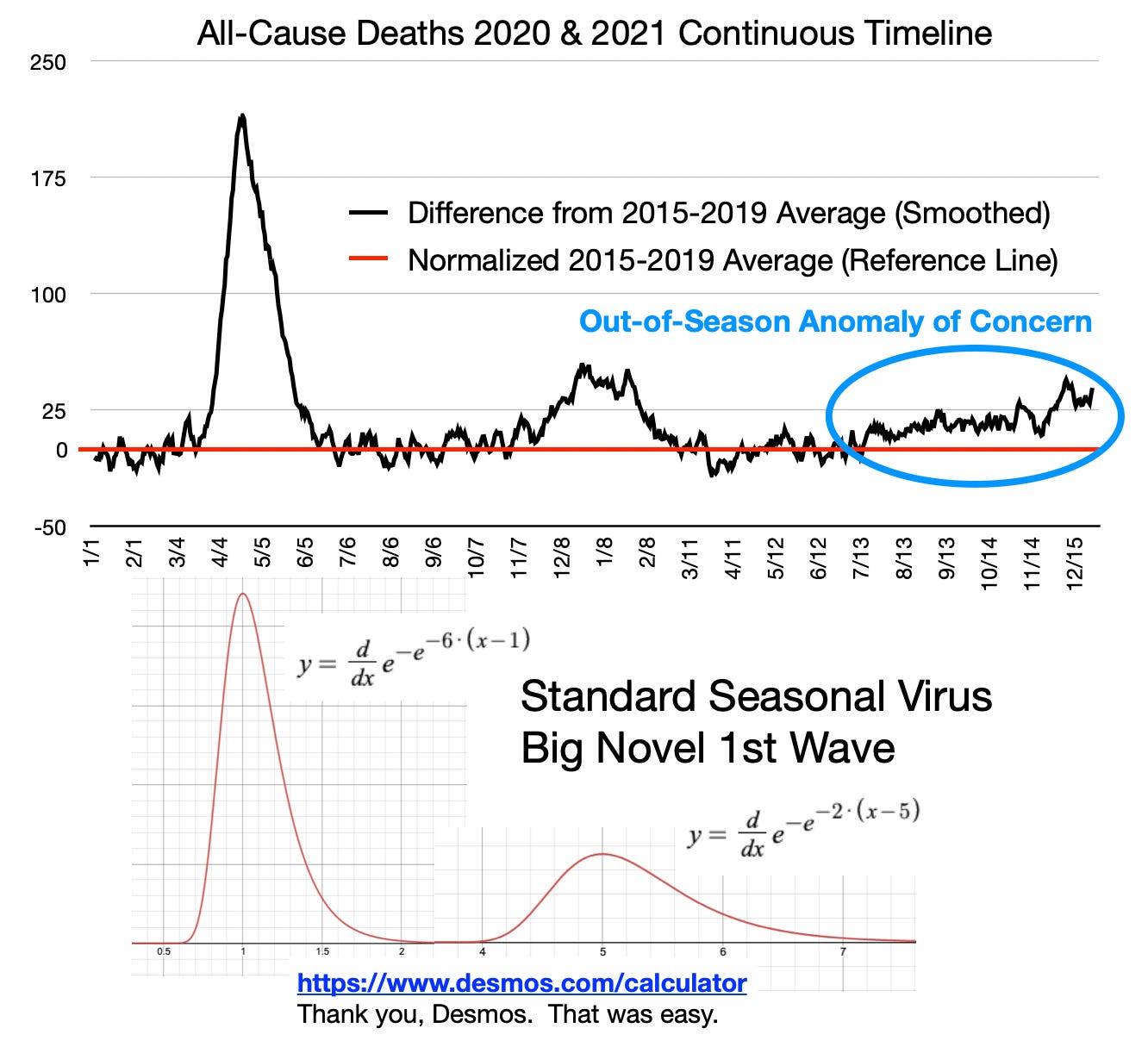
Graph 5
Visual Inspection (Graph 5)
It was difficult to envision the end of 2020 black rolling into the beginning of 2021 blue. Graph 5 (normalized to a reference and then smoothed) is a continuous all-black timeline from start of 2020 to end of 2021. There is a standard Gompertz function of a seasonal virus patched together below the graph. Pay no attention to the equations used to get the desired shapes.
The additional depiction to note in Graph 5 is that C19 in Massachusetts strongly correlates to a perfect Gompertz seasonal disease model … except for the anomaly of concern.
IMPORTANT - The section of black line highlighted in the blue ellipse seems low only because the graph scale accommodates the actual 10-week pandemic in early 2020. The blue ellipse section represents an excess of 10% to 20% deaths nearly every day for 5 months and shows no sign of stopping in 2022. Neither of the actual C19 waves lasted that long. The initial wave began late in the first season, but ripped through harshly and infected many people who never knew they were exposed. They achieved natural immunity. That makes the transmission rate R0 smaller in the next wave. The second wave had the opportunity to start from the beginning of the season, unlike the initial wave, which came late just before spring. The second wave blew itself out by the end of February 2021 before the C19 gene modification could be delivered to a significant portion of the population and take credit for stopping the deaths. Most of the vulnerable had already died or recovered with natural immunity. The great lie is that seasonal diseases like these can be anticipated, vaccinated against, and linger more than a couple years. None of that is true of the C19 type of disease. Everything government did was late and useless.
Summary of - IS THERE AN ANOMALY?
The blue ellipse should taunt and haunt any reasonable person of genuine empathy. Excess deaths of 30 people per day for 100 days is 3,000 unexplained deaths. That is quite an anomaly that does not match known disease models.
Additionally, the importance of investigating this steady state excess anomaly goes beyond the quantity of deaths. If the anomaly comprises deaths of people lower in age than the C19 victims, then the life-years lost from the cause of the anomaly is significantly greater than all life lost from C19 itself. Please take the time to understand this. Reread if you must.
Because this is so important, here it is again another way. If the anomaly of excess deaths comprises people under 70-years-old, then this anomaly of life years lost is far worse than the entirety of the C19 pandemic.
WHOM DID THE ANOMALY AFFECT AND WHEN?
The demographic breakdown reviewed is by age group. There are likely smaller gender, race, ethnicity, and income differences. Age is well-known to dominate variability in demographics of C19.
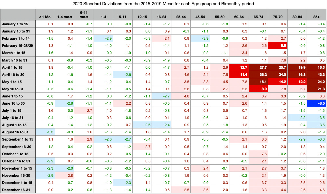
Table 1
Method (Table 1)
Table 1 is a heat map of standard deviations from mean. It was built by the following method.
Sort and filter from the database into 24 periods and 15 age groups into a spreadsheet for each of years 2015-2021
Build a sheet for the average and a sheet for the standard deviation representing each cell across years 2015-2019.
Populate the final sheet by subtracting the mean from same cell in 2020 raw numbers, then dividing that difference by the standard deviation for that cell
Condition the cell color schemes by value ranges
Visual Inspection (Table 1)
Standard deviations from mean rather than percent changes from mean is a preference of the author. Percent differences would have yielded wild numbers for the younger ages.
Observations (Table 1)
Dark red and red: the COVID-19 pandemic spanned April 2020 to May 2020
Most affected ages of death are greater than 60-years-old
Pink to red and dark red is a horizontal alley of time in ages greater than 25yo
There is a very small wave starting around October/November in ages 65-74 and then in December in ages greater than 65
Below 25yo does not appear to have many deaths greater than normal
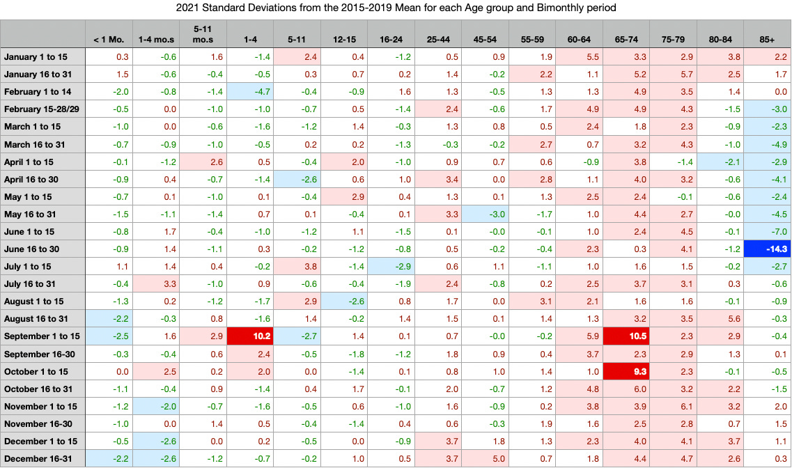
Table 2
Visual Inspection (Table 2)
Table 2 is the same method as Table 1 but for the year 2021. Many changes stand out in 2021 versus 2020.
Observations (Table 2)
Perhaps because so many over-85yo’s died in the 2020 pandemic, there’s a deficit as one would expect in 2021 in the blue vertical top right bar of Table 2
U25 groups worsened in total from 2020 to 2021. These low total deaths are better inspected by individual record. (Stress from government orders may have caused homicides, suicides, overdoses, and abuse.)
Most notably, 2020 pandemic (pink, red, and dark red horizontal group) was limited in time to April-May across all adults, whereas 2021 shows a vertical alley almost all year long (not a pandemic) across ages 60yo to 84yo
Important: Ages 65yo to 79yo continue to die above normal throughout 2021; but Graphs 1-5 show mid-February to mid-July to be zero ∆ from normal; likely reason —> over-85yo’s Feb-July 2021 deficit offset and obfuscated above normal deaths from other ages in that period
The anomaly becomes apparent in Graphs 1-5 when blue 85+yo deficit ends.
Summary of WHOM DID THE ANOMALY AFFECT AND WHEN?
The anomaly continues to present itself and it appears that more people were dying at ages younger in 2021 than in 2020 and throughout the entire year, not just during an 8 to 10-week pandemic like in spring 2020.
Readers please note that every region is different. R0 will change based on climate, urban living density, and cultural manner of interaction. Do not try to correlate the dates of pandemic in Massachusetts to other locales. Sweden is more closely associated with Massachusetts than Michigan or Quebec.
HOW DID THE ANOMALY MANIFEST IN IMMEDIATE AND UNDERLYING CAUSES?
The next step is individual records searches. Good starting points are the highest standard deviations from mean in bright red 2021 (10.5 and 9.3), in September 1 to 15 and October 1 to 15, which are both in age group 65-74yo.
The database was filtered by Age = 65-74, UNITA = DAYS, Date of death begins with month “9” and Date of death begins with month “10”.
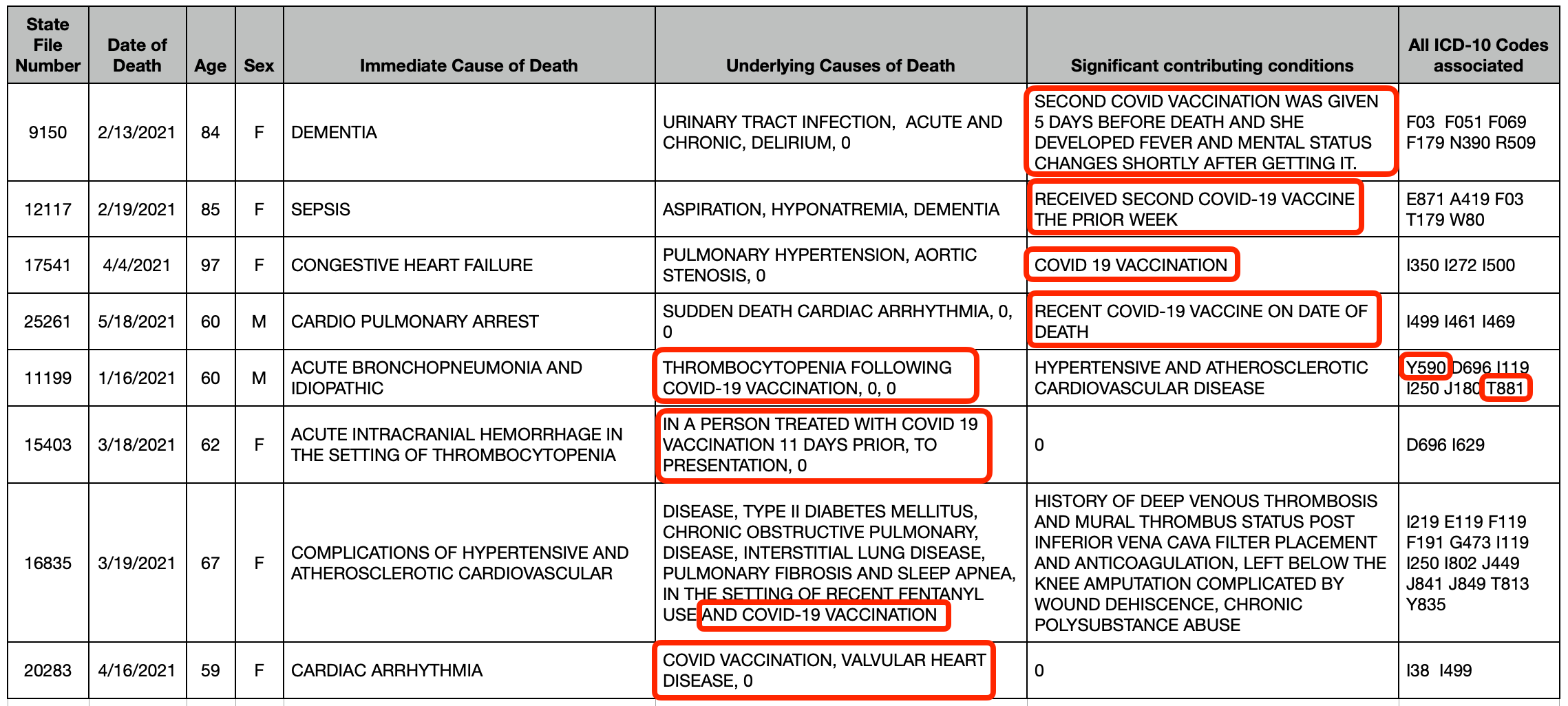
Circulatory system related “Immediate” causes of death stood out to this author. Here are a few examples:
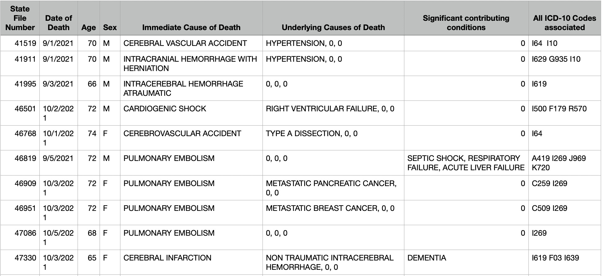
Table 3
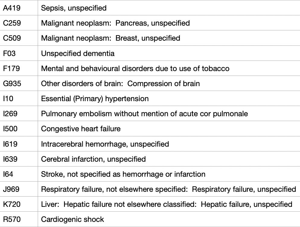
Table 4
Remember that none of this forensic process is a scientific method. This is more like finding an accounting error or a bug in a “C” program. “Here’s an anomaly. Start at the top and look down into the hierarchy for it.”
In Table 3 are strokes and pulmonary emboli deaths resulting from bleeding and clotting (hemorrhagic and thromboembolic). The circulatory system appears to be a good choice to start looking for the cause of the anomalous 10% to 20% excess throughout 2021 that does not resemble a pandemic.
Table 4 lists a few ICD-10 codes (a letter and then numbers). This classification schema is used internationally for doctor visits and death certificates.
Table 3 lists the ICD codes in the far right column. Pulmonary emboli are listed as “I269”, which is chosen as the next starting point in heat map visualization.
References to medical phenomena and research papers are intentionally avoided in this article. A hint for the anatomy-challenged: search for interactions between “right ventricle" and “pulmonary emboli.” Interesting papers immediately come to the fore and likely explain many of the CoD’s in the database including record “46501” in Table 3 above, which does not even include an I269 PE.
Following are heat maps of I269 involved deaths in 2020 and 2021 compared to the 2015-2019 mean. These are shown in three different ways to see different perspectives.
The following two tables are STANDARD DEVIATIONS FROM MEAN:
2020 - I269 StDev’s from Mean of 2015-2019
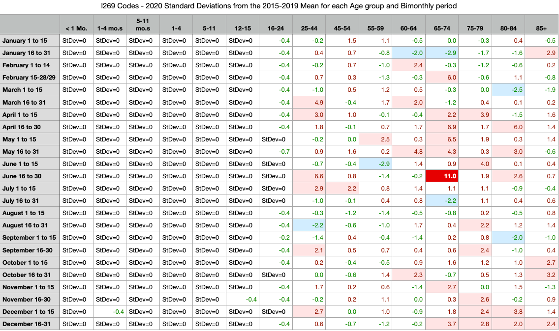
Table 5
2021 - I269 StDev’s from Mean of 2015-2019
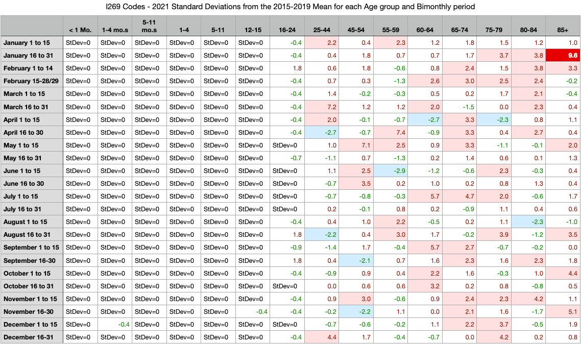
Table 6
Visual Inspection (Tables 5 & 6)
Nothing illustrative jumps off the heat maps in Tables 5 or 6
Observations (Tables 5 & 6)
PE’s are extremely rare (in the true sense of “rare”, not the new pharma perverted usage) in anyone under 25yo
Table 5 of 2020 shows a general shape of pink in the 65-74 age group during the actual pandemic found on the all-cause heat map
Table 6 of 2021 is interspersed throughout the year across all adult ages
The sensitivity of color mapping could be dialed up to show more
Perhaps a percentage difference will show something different.
2020 I269 % > Mean of 2015-2019
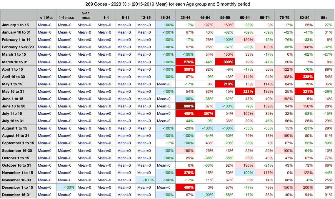
Table 7
2021 I269 % > Mean of 2015-2019
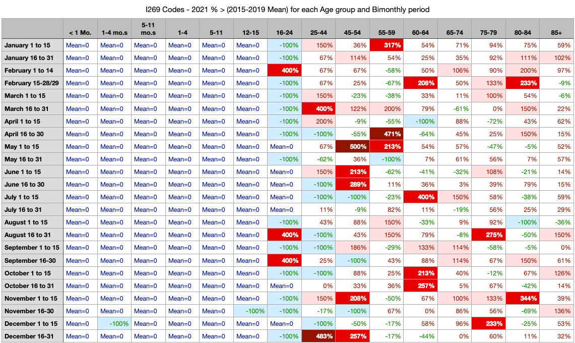
Table 8
Visual Inspection (Tables 7 & 8)
Nothing illustrative jumps off the heat maps in Tables 7 or 8. The sensitivity settings for the color coding in percent differences are showing a little more, but raw number differences from mean is likely to be better.
Observations (Tables 7 & 8)
PE’s just don’t happen in anyone under 25yo.
There are 75% more red and dark red in 2021 than there are in the pandemic year of 2020.
Knowing that C19 itself can cause clots resulting in strokes and PE’s, it’s quite concerning that the year of C19 gene modification has 75% more than the year of the disease. This may be the nexus of the anomaly investigation. This is worth one more look from a raw number perspective and adding subtotals for both rows and columns.
2020 I269 Raw Numbers ∆ from Mean of 2015-2019
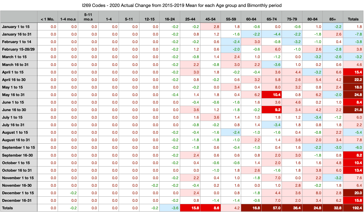
Table 9
2021 I269 Raw Numbers ∆ from Mean of 2015-2019
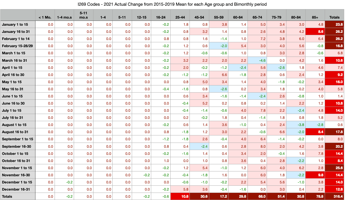
Table 10
Visual Inspection (Tables 9 & 10)
Adding the totals to the rows was very valuable. The spring 2020 pandemic clearly shows increased deaths from PE’s for the exact time of the pandemic. At the end of 2020, the small pandemic wave is also evident. And in 2021 there appears to be a yearlong excess of PE’s with only a few breaks in time.
Observations (Tables 9 & 10)
PE involved deaths still don’t happen to any significance in those under 25yo
2020 total PE-involved deaths above normal average 2015-2019 is 192.4
2021 total PE-involved deaths above normal average 2015-2019 is 316.4 !!!!!
Pulmonary embolism related deaths in the C19 gene modification year of 2021 are 64% higher than the C19 pandemic year of 2020. Total C19 deaths in Massachusetts were far lower in 2021 than in 2020 (fraud not accounted for yet).
This is a SUPER-ANOMALY.
INVESTIGATION SUMMARY
At this point, it is best to look at yearly aggregate circulatory system related deaths to determine if I269 was an outlier or a good guess from the individual record inspection.
This ends the “learning what to look for” phase of this article. From this point, there will be investigation of age groups by year and by circulatory system individual causes and groups of cause.
WELCOME TO THOSE DOCTORS AND SCIENTISTS WHO SKIPPED THE INVESTIGATION PATH THAT LED HERE
BEGIN HERE TO VIEW DATA
I269 - PULMONARY EMBOLISM WITHOUT MENTION OF ACUTE COR PULMONALE
At the beginning of this article were mentioned differences in visualization among graph types and expected values based on TREND or AVERAGE methods. There is no method that can hide the fact that PE’s are up substantially higher than expected values. When visualizing the trends, be sure to not include the last two bars. For example, look at Ages 25-44. It may seem like a steep trend because of 2020 and 2021. However, if you only look at 2015-2019, you’ll envision the trend line falls far below the values of 2020 and 2021. There is plenty of excess in both 2020 and 2021 for ages 25-44. This is disastrous.
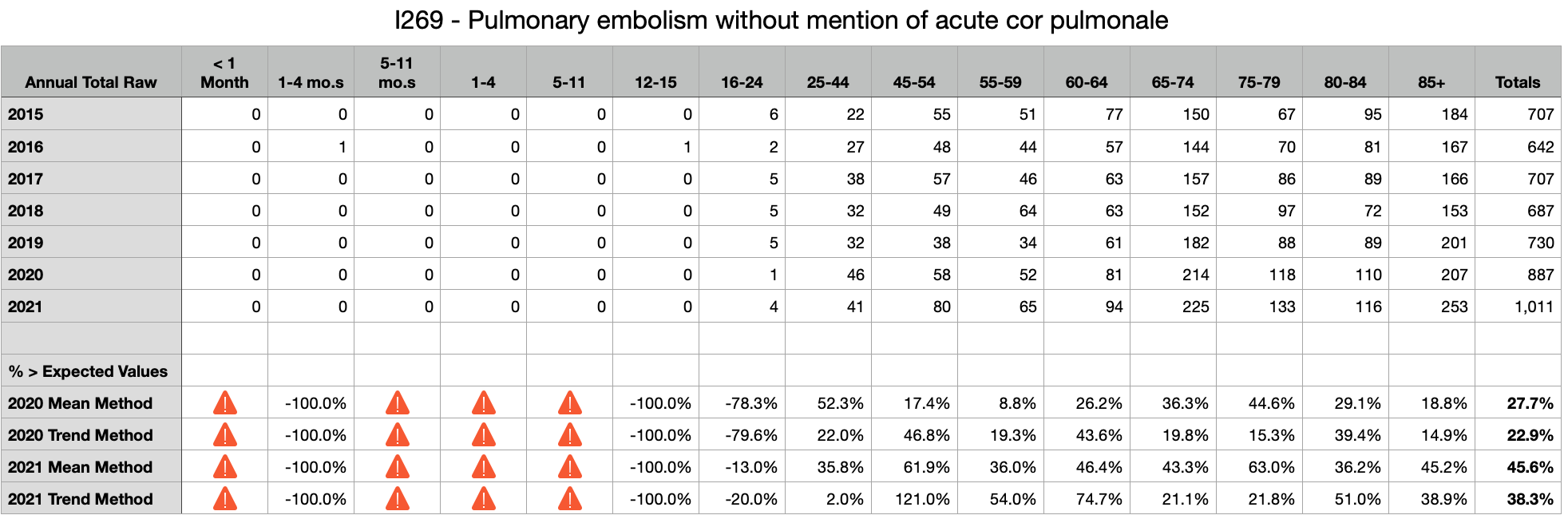

Observations
In the C19 pandemic year of 2020, Total PE’s were up between 23% and 28% over 2015-2019 mean.
In the C19 gene modification year of 2021, Total PE’s were up between 38% and 46% over 2015-2019 mean.
Every age group over 24yo shows significant excess PE’s in 2021 despite significant excess in 2020 that should have emptied the well, so to speak
Six excess deaths in ages 25-44 equate roughly to 240 life-years-lost. Seventy-one excess deaths in ages 85+ equate to 71 life-years-lost. These younger deaths across the board are much more substantial losses of life than people realize looking at graphs. These are families who lost fathers, brothers, mothers, sisters, and children. These are devastating to multiples of people per death and unlike the loss of an 80+yo. Ask anyone who lost a son or daughter or brother or sister. These are not just numbers and graphs. These are human beings with finite time on Earth.
D65 - DISSEMINATED INTRAVASCULAR COAGULATION [DEFIBRINATION SYNDROME]
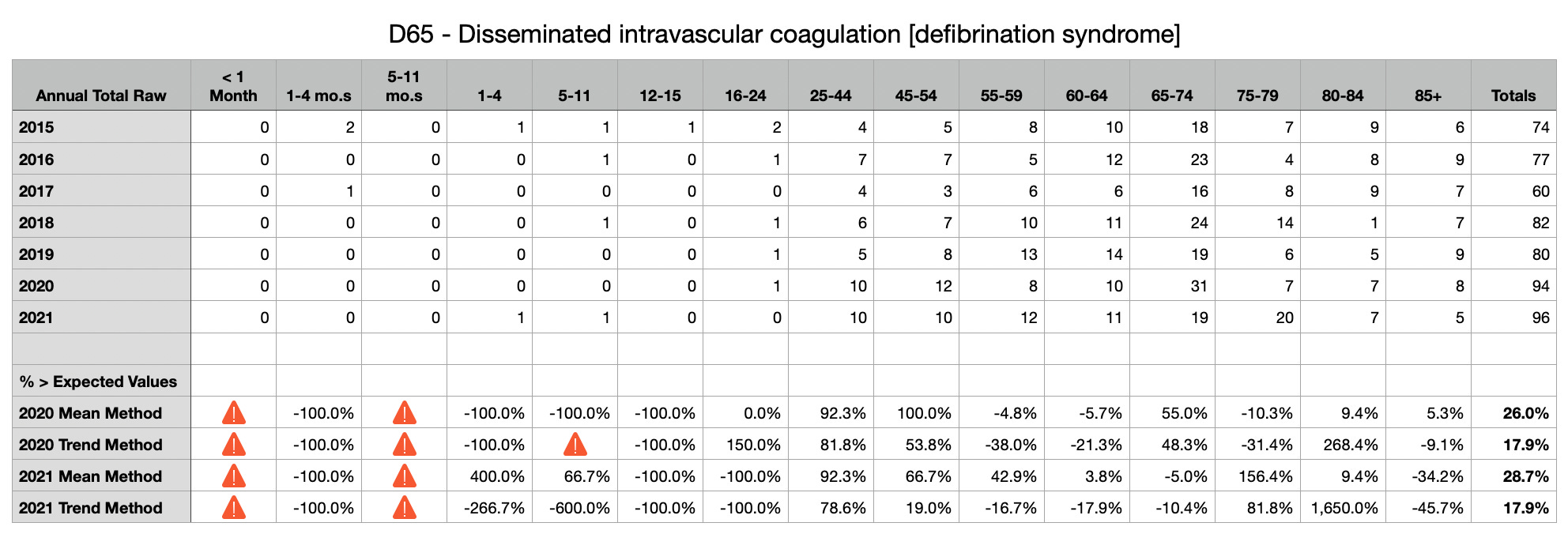
Observations
In the C19 pandemic year of 2020, Total DIC’s were up between 18% and 26% over 2015-2019 mean.
In the C19 gene modification year of 2021, Total PE’s were up between 18% and 29% over 2015-2019 mean.
Not easily observed, if 80+ are removed from analysis due to 2020 pandemic excess, then the U80 total excess by both methods are 15% to 30% excess DIC’s in 2020 and 17% to 39% excess DIC’s in 2021. This is substantial for younger ages and life-years lost.
Again, there seems to be no question of significant excess whether TREND method, which nullifies trending, or AVERAGE method is used.
=-=-=-=-=-=-=
D696 - THROMBOCYTOPENIA, UNSPECIFIED
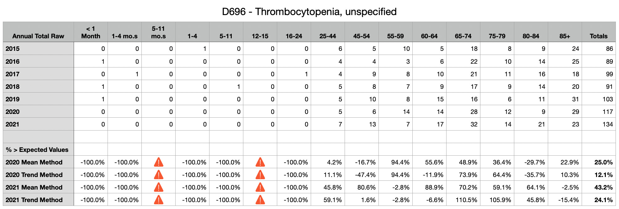
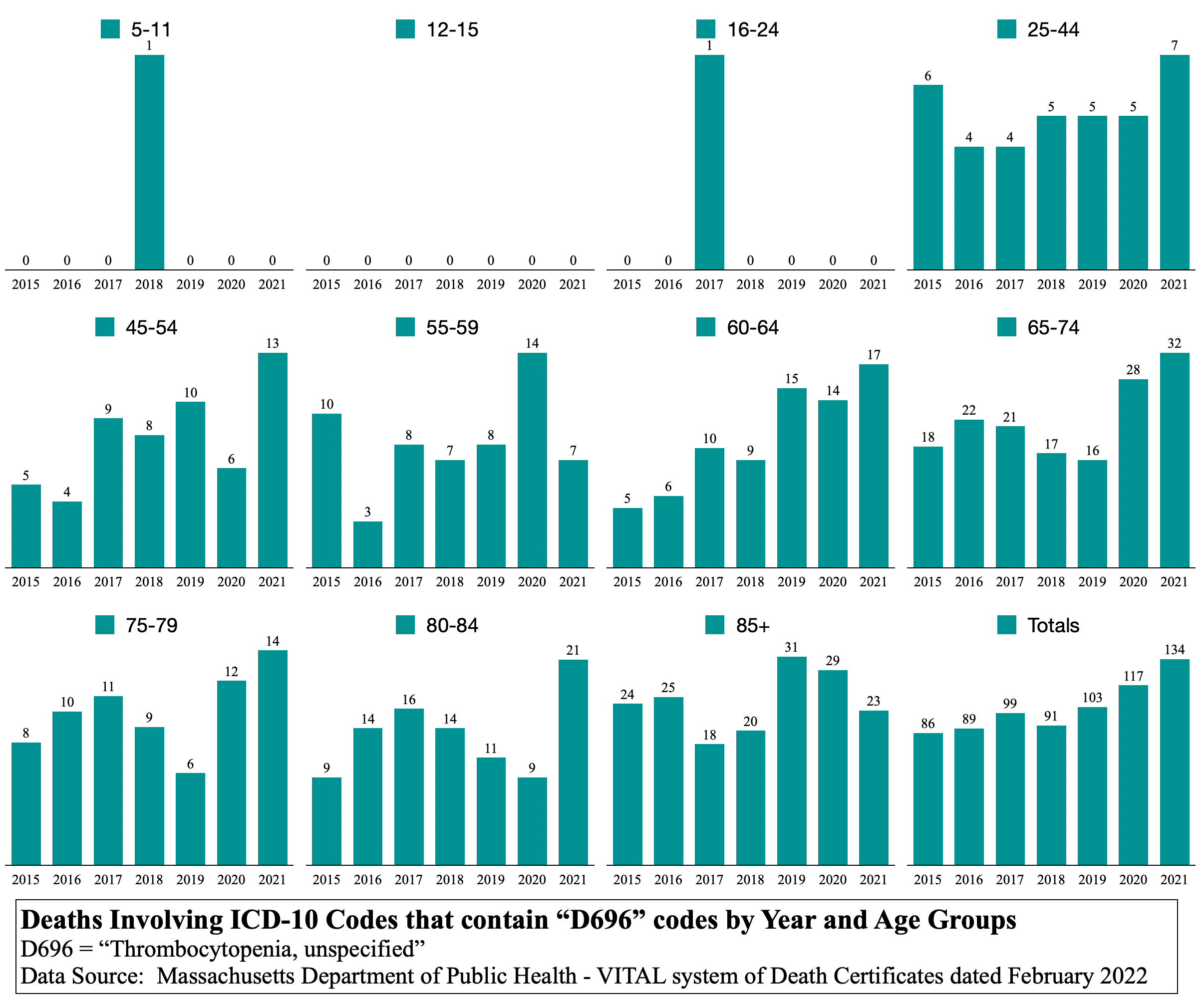
Observations
In the C19 pandemic year of 2020, total thrombocytopenia involved deaths were up between 12% and 25% over 2015-2019 mean.
In the C19 gene modification year of 2021, total thrombocytopenia involved deaths were up between 24% and 43% over 2015-2019 mean.
Not that it can be known for sure, but it seems that the C19 gene modification injection does what the C19 disease does, but far worse in the circulatory system, which is not a surprise since it is injected into the body past the mucosal immune defenses in the lungs.
This is a disaster of vast life-years lost. In only three codes thus far, there are more than 200 deaths that equate to life-years-lost in the thousands.
This article could end here and be compelling enough to stop injections immediately around the world.
(THE FINAL METHOD OF INVESTIGATION BEFORE CONCLUSIONS)
ARE THE UNDERLYING CAUSES TRACED TO C19 GENE MODIFICATION AS A ROOT CAUSE?
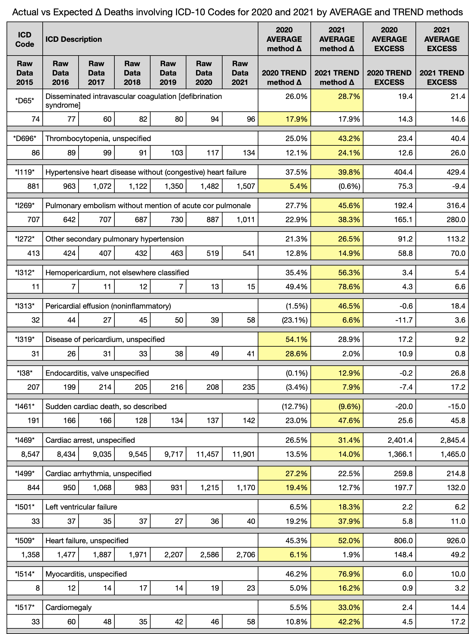
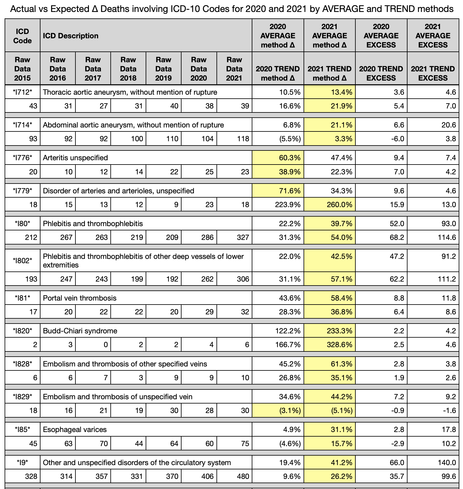
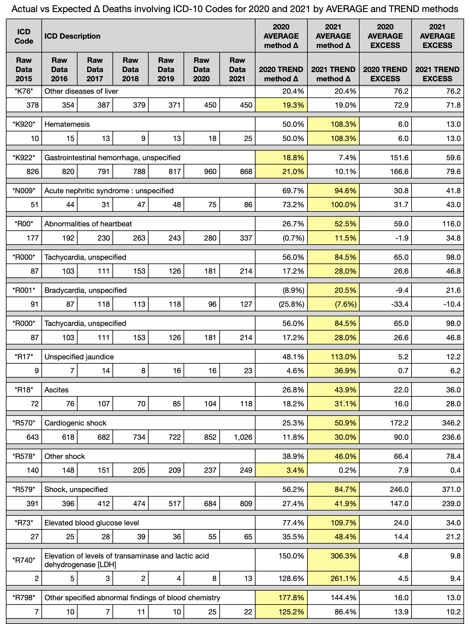
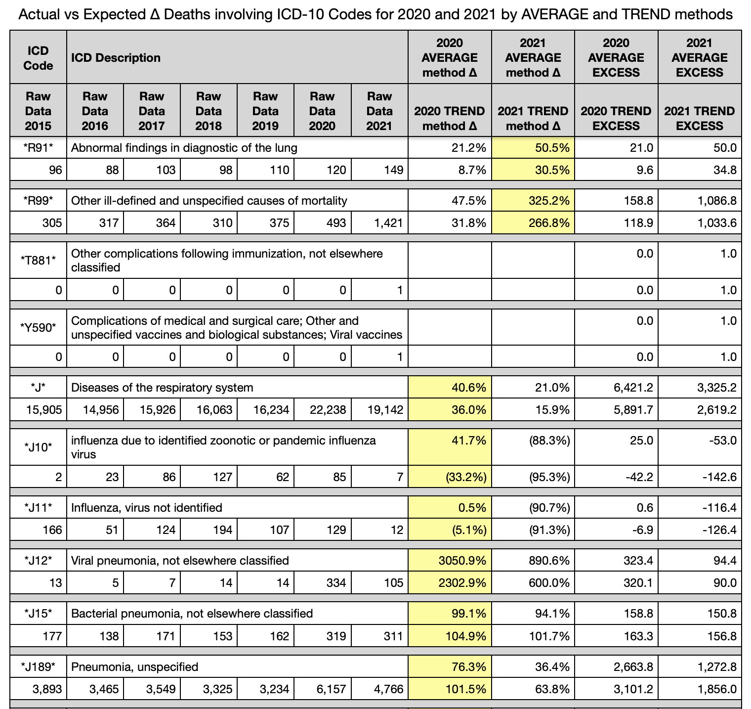
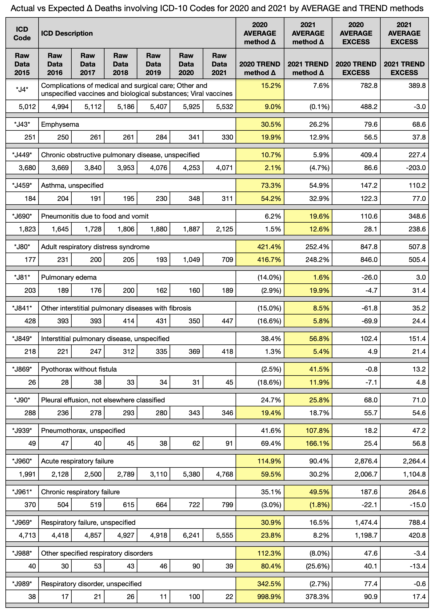
The closing method compares more than fifty ICD-10 codes from circulatory and respiratory categories. A few other codes of interest are listed from which comments are proffered in “Conclusions”.
Only yesterday, a familiar told this author, “You cannot prove that the deaths are linked to the vax.” No one can prove today that the sun will not emit a flare that will destroy all life on Earth tomorrow. In law and economics, a few select words represent standards of proof upon which juries and judges rely in adjudication: rationality, reasonableness, clear, convincing, preponderance, and a mere hunch.
Each reader will individually assess where on the spectrum of standards of proof the following analysis of more than 50 respiratory and circulatory ICD-10 codes lands.
One question should nag all who engage the following tables of ICD-10 codes:
How does a virus change from overwhelming dominance in respiratory illness to overwhelming dominance in circulatory illness in just one year?
Spreadsheet and graph generators were built to parse more than 400,000 death records in the database. The single input is a short string of a partial or full ICD-10 code (“I269” or “I2” or “I”). The generator then builds sheets and graphs by searching the last column of death certificates, which contains a concatenation of all ICD-10 codes listed as being involved in the death.
Very many “I” codes (circulatory system) were input.
A few other related or interesting codes were input.
Many “J” codes (respiratory system) were input as a sanity check for 2020. C19 is a respiratory virus after all. Right?
A condition is set on the ∆ columns that the greater excess between 2020 and 2021 is highlighted in yellow. Id est, calculate the excess death as a percentage in 2020, then in 2021 for each ICD-10 code. The larger of the two is then highlighted in yellow.
NOTE: each death may have multiple codes and, thus, the excess deaths in the far right two columns should not be added to get any kind of totals. There is overlap.
Observations (tables are at bottom - there are too many to insert them here)
Circulatory system issues (I-codes) in 2021 are far above normal in %∆ by average method and by trend method. The numbers are mainly 15% to 50% above normal average 2015-2019.
Circulatory system issues (I-codes) in 2021 dominate over 2020 in circulatory system issues in both quantity and in %∆ (excess %).
Respiratory issues (J-codes) in 2020 similarly dominate over 2021 and normal average 2015-2019 in both quantity and in %∆ (excess %).
Notice that pneumonia, which accompanies both influenza and C19 was incredibly high in both years, and much more in 2020; but influenza cases were near zero in 2020 and 2021. C19 tests are free to the individual per emergency authorization budgets from USA government. This author knows that influenza tests were greater than $400.00 ten years ago upon being in Massachusetts while ill.
There are a few respiratory issues that 2021 dominates. They are in a section of pneumothorax, pyothorax, and interstitial pulmonary diseases. A cursory thought process leads one to ask if the circulatory system may have been the root cause of these issues.
Liver issues, vomiting blood, gastrointestinal bleeding, and acute kidney issues are all up in both years, but 2021 is much higher than 2020 in most of them.
Nearly all the “R” code symptoms related to heart and shock are much higher than average in 2021, especially over 2020.
“R99” is a holding category for results pending. Since this database was received in February 2022, there are ~ 1,400 yet to be categorized R99 codes. Most years are in the 300’s range. This means that another ~ 1,000 deaths have to be recategorized to the correct causes of death. Not seen in this article, but known by this author, is that most of them are in the last few months of the 2021 year. This means that all the numbers in this article could be inflated even more than what is seen herein. When reassigned to causes, “I” and “J” and “D” and other codes, they can only show a worse situation, not better.
T881 and Y590 in the tables below have exactly one record each listed in 2021 and zero for all other years … and it is the same person. These codes are for complications following immunization and complications from viral vaccine.
CONCLUSION
Three of the four questions posed have been answered:
There is an anomaly in all-cause deaths beyond the obvious 8 to 10-week spring 2020 pandemic. The anomaly lasted nearly all of 2021, but manifests visually only from July 2021 through the end of the year and continues into 2022. The first half of 2021, the anomaly was negated by the lack of 85+yo deaths evident by the vertical light blue stripe on the right of the 2021 heat map
The people affected in 2021 may be considered old, but they are younger on average than in the 2020 C19 pandemic as seen in the vertical pink alley in 2021 heat map.
In order to achieve an all-cause excess mortality of 10% to 20% during 2021, any single or few multiple cause increase would have to be higher in order to affect the all-cause full population denominator. Indeed circulatory system issues are much higher and account for many excess deaths in the order of thousands, but are likely masked by the numerous bleeds and deposits of clots yielding a smattering of different “I” and “D” and “R” codes.
No effort is made in this article to tie the C19 gene modification biological injectable product to a mechanism for the circulatory system deaths. Any doctor, scientist, or pedestrian reader can make that inference from the overwhelming correlative data herein. There are tens of thousands of life years lost in 2021 in excess of what was expected by any mathematical formula. These are not from C19. The math does not work out.
Again, the official Massachusetts database of death certificates contains proof that C19 gene modification biological injectable products killed thousands of people in Massachusetts in 2021.
Pandemics do not switch from respiratory to circulatory causes of death in one year. [add sarcasm now] Perhaps it can be done this way. Take the deadly part of the virus and change the mode of entry from aerosols entering lungs to direct injection into the blood stream [lottery win if it gets into a blood vessel].
NOTES
There is a table of eight (8) deaths mentioning “vaccin” or “immuniz” as string searches. Of the 8, only one has ICD-10 codes referring to the injection as a possible cause. The omission of ICD-10 codes is civilly negligent at the very least, and is likely a criminal act of intentional omission leading to fraud on a public record. This will be addressed in the next article. Massachusetts is rife with fraud throughout the entire medical establishment. They do not see it as fraud or as a crime. They see it as the normal course of business for the biggest industry in their little state of 6.9 million people. To those who are injecting children and pushing these death lottery shots, how can you get through another day knowing you were, are, or will be responsible for taking the lives of young children? Or leaving families without a mother or father?
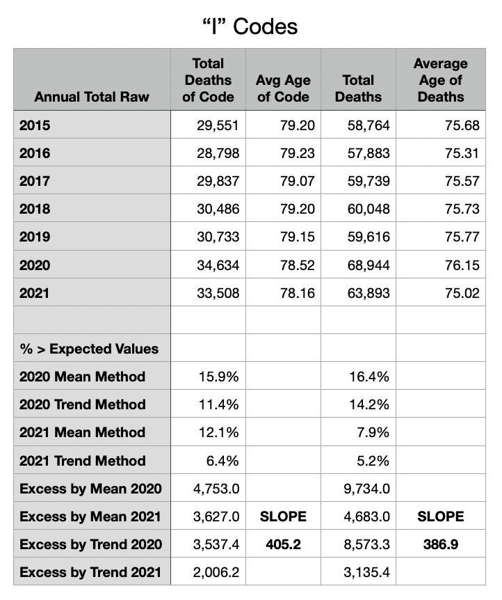
Oh, let this article finally end. Please notice the two tables at the very end. Notice the change in average age by year for both “I” and “J” codes, but more importantly for all-cause total deaths each year in Massachusetts. The average age was lower in 2021 than any of the prior 6 years. That might be expected after a pandemic year that took the old people. However, the total deaths are 3,000 to 4,000 higher in 2021 than any other year except 2020. The average ages of those excess 3,000 to 4,000 who died in 2021 had to have been much younger to change the average as much as they did.
URGENT PLEA
There is not another dataset out there like that one that definitely proves prolonged excess death in causes specific to the circulatory system and in numbers in the thousands of lives and in younger people than expected. C19 was over in Massachusetts in June 2020. What has happened since then has been a hidden disaster of biological injectable product madness.
Please focus on the yellow highlights below. Try to understand the numbers and the deaths that come from this C19 gene modification poison.
God bless you all and thank you for reading.

Subscribe to Coquin de Chien’s Newsletter
Commentary on the Idiocracy
https://coquindechien.