This article defines credit, a subject upon which there is a lack of public knowledge. What people call money is in fact credit, and money itself, which is physical gold without counterparty risk, rarely if ever circulates. Nearly everyone, including most economists, don’t understand credit and the importance of its value being tied to money.
Nor do they understand that bank credit is just a minor part of the colossal system of credit.
A common mistake is to think that bank notes are money, because unlike a bank deposit they are possessed in hand. But they are a credit liability of the issuers, which today are central banks. Their value depends entirely on the public and foreign creditors’ faith in terms of their purchasing power, like any other form of credit.
The expansion of credit is fundamental to economic progress, but that expansion can only be determined between creditor and debtor. This does lead to disruptive fluctuations in bank credit, but they are self-correcting. Far worse is government abuse of credit and their attempts to manage economic outcomes.................
......It has never been so important to understand credit, and the fact that since 1971 it has been totally divorced from global money, which legally and naturally is physical gold. It is an egregious error to think that the dollar has replaced gold — maybe the dollar is the highest form of credit, but it is not money.
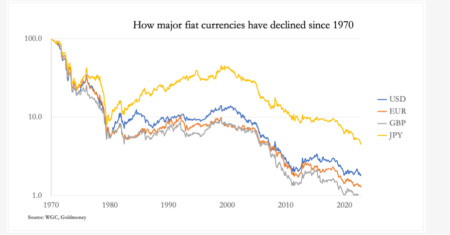
The ending of the dollar-based credit system is now in sight, an inevitability which has been entirely predictable. From an equivalent value of $20.67 to the ounce, legally confirmed in 1900 but existing de facto from the 1850s, the dollar has already lost nearly 99% of its value. Most of this has been from 1971, shown in the last of our charts:
Additionally, there is evidence that China and Russia have prepared themselves for a G7 credit crisis outlined in this article by accumulating substantial quantities of bullion, which they can use to back their currencies. The moment this option is triggered, the entire dollar based credit system will be threatened with collapse, if only because everyone will wake up to the fact that has been legally true since Rome’s first laws in the Twelve Tables and confirmed by John Pierpont Morgan in testimony to Congress in 1912: that gold is money, everything else is credit.
“Can Dangerous Environmental Tipping Points Be Averted?” ~ DW.com. Short answer – NO. Long answer – the media, the UN, the WEF have proclaimed that the end point has already been traversed multiple times – they just keep moving the goal posts. Why? The obvious answer is because the money going to the Green Fund needs a continuous flow in order to launder it back to politicians. If they acknowledge we have reached the point of no return, why spend any more time, effort and money fixing a dead problem?
As of 12-31-22, the Green Fund was sitting on Assets of $11.7 Billion with total liabilities of $810 Million – the vast majority of which was a ‘new loan’. Two outstanding figures on the Financial Statements include – Loans Receivable and Loans Payable. Sitting on over $8 Billion in cash, it is curious the Green Fund would increase their borrowings by 90% over 2021, as in their ‘liability’. Loans Receivable would indicate the fund is making ‘micro-loans’ instead of actually disbursing income – $11 billion is Assets/Cash.
Which of course, is the point – to raise contributions so that the fund becomes income generating via microloan interest rates exploiting the poor. The Green Fund has many competitive friends including JP Morgan, George Soros, Citigroup, USAID, and Sequoia Capital who represent just a few of the investors who reap massive interest income rewards charging upwards of 100% per year. The typical client? Women.
What happens when a person cannot pay back the interest or the loan? They lose their house, their land, their business, and often their – life.
The UN and World Bank are complicit. The regional resources that are targeted are thus slowly transferred to the bank making the loans for pennies on the dollar. Poverty is extended. And local governments are given a piece of the profits to keep their mouths shut.
One such place is Barbados. A colony of Britain, Barbados still operates slave trade. The Green Fund and microlending are rife within this small island community. Despite growing rage, King Charles’ response was to request a ‘study’ be done to assess the slavery on Barbados. The Netherlands apologized and continued on unabated. Typical farm employees earn $900 per month, 25% earn less than $600 per month.
The largest plantation land owner in Barbados is Richard Drax, a member of the British Parliament. His family has been and continues to support the slave trade that has existed for over 200 years on his plantation. While Drax failed to provide the required financials as a member of Parliament – it is estimated he is worth well over $150 million.
WATER SCARCITY
According to the UN University Institute For Environment and Human Security, 70% of groundwater is used for agriculture. The plants that are the most water dependent are rice, soybeans, wheat, sugar, cotton and alfalfa. Rice – they say – is a disaster for Africa due to the frequency of droughts. The drought friendly plants include peppers, chickpeas, corn, tomatoes, okra and rhubarb. In Africa Sorghum is an abundant nutritious grain that is drought tolerant and is used for human consumption, animal feed, alcohol, and as a biofuel. So why are they still growing rice?
The global cast for rice growing are China and India. In fact, of the ten countries which are the producers of rice – Africa does not even factor in at all. The myth. China produces more than all countries combined with the elimination of India. But the Green Fund, the UN, and the NOAA, don’t even mention China. The countries producing the most soybeans? Brazil and the US. Soy is used extensively to make fake meats. Other common ingredients include grains, beans and wheat – all of which require massive amounts of water.
In other words, the US and China are using the MOST water unsustainably than any other countries across the globe. But the Green Fund goes to Africa… Why?
Fast answer – because if Africa were to be able to develop its resources without western colonial interference – Africa would become a heavy weight industrial nation – competition. Therefore it is of paramount concern for the strategies implemented by the UN and Bill Gates to keep Africa in a forever state of abject poverty. All while giving false information about the state of the Climate, the Globe, Food and Water.
Global Surface Temperature.
According to NOAA, between 1880 and 1940, the global surface temperature was negative – as in an ice age. Between 1980 and present day, the surface temperature rose to 1. 1880 is used as the baseline because global surface temperatures were not taken and unknown prior to this year. In fact, there was no ‘global’ baseline because there was no ‘global measurement’, it was a singular measure taken either in Europe or the US.
The concept forces a false baseline and a false ‘global’ estimate.
The methodology of measuring sea temperature between 1880 and 1940 was accomplished via a sailor rowing out to sea, taking a bucket tied by a rope, collecting some water and measuring the temperature using a mercury thermometer. Surface temperatures are taken at various stations around the globe, and their reliability is also suspect given the position of the stations is subject to ‘interpretation’.
As a result, raw data is ‘corrected’ to comply with the thought police of science …
In other words, surface and sea temperatures are unreliable today and worthless before, during and after upgrades in 1990. The entire comparison methodology is false.
Greenhouse Gas Emissions:
Greenhouse gas emissions are measured via a formula based on utilizing CO2 levels as the equivalent and multiplying that by the Global Warming Potential (GWP). The global warming potential assigns a grade to gases such as nitrous oxide, methane, etc… However, some countries use a different value system in creating their ‘estimates’ which are ignored in the final tally by the Intergovernmental Panel on Climate Change (IPCC) – created by the UN in 1988. This GWP methodology was developed between 1995 and 1997 – when the world began…
The authors of these IPCC reports are aged from late 50’s to mid 80’s – well before Climate Change was offered in ANY university as a degree much less a program. There is no true “expert on climate change”.
Making the entire methodology false and misleading.
The Climate Change Hoax for the advent of The Green Fund, was simply created as another $$$$$$$ Industry to launder money away from taxpayers to the governments. It has no basis in reality and no basis in Science: “The systematic study of the structure and behavior of the physical and natural world through observation, experimentation, and the testing of theories against the evidence obtained.”
Climate Change is a philosophy – which is NOT a truth, but an opinion.
The data is clear and consistent. I challenge any qualified scientist to challenge this data in an open public debate
Executive summary
The irresponsible attacks by an LA Times journalist on MSU Professor Mark Skidmore’s paper motivated me to run my own survey of my readers to see what the actual harm numbers really are.
Over 10,000 readers responded.
The survey clearly showed that the COVID vaccines have killed 3.5 times as many people as COVID. This is a disaster.
I’ve had expert statisticians and epidemiologists review the survey, the methodology, and the results. None could find any errors.
I’m willing to put a million dollars on the table that this is right and that the vaccines have killed more people than COVID. Any takers? If not, why not?
When I called Professor Norman Fenton and informed him of the 3.5X figure he calmly replied “I’m not surprised.”
The results of this survey are entirely consistent with the surveys by others as well as individual anecdotes that would have been very unlikely for me to have located if the vaccine didn’t kill at least 3.5X more people than the virus.
Therefore accusations of “the survey was biased” are simply “hand-waving” arguments with absolutely no evidentiary basis of support. Could there be bias? Of course. Is the bias significant is the question! Since these people are anti-vaxxers, they are simply less likely to vaccinate and so the number of vaccine injuries will be LOWER than an unbiased group who vaccinates. So yes, there may be bias, but if anything the bias suggests that the actual ratio is higher than 3.5. I’m happy to have that discussion. Bring it on.
The best way to challenge these results is to show data that is 100% independently verifiable (which government statistics are not). So they will have to show us their survey and their verifiable anecdotes supporting their hypothesis. No one has any interest in doing that for some reason. These people are all perfectly content with having the number be “unknown.” I have a big problem with that.
Finally, if any epidemiologist(s) with a h-index of 20 or more wants to publicly challenge the 3.5X result in an open public discussion, it’s easy to contact me. The h-index is simply a way to ensure we have a meaningful level of discourse. The people on my side of the debate table will have a combined h-index of over 100.
The data
Having record level data available where every record can be independently verified is critical. The other critical thing is making all the record level data publicly available.
I’ve done both. The health authorities NEVER do either.
The Excel analysis of the first 9,620 responses which shows the responses are consistent with a Poisson distribution and also that hundreds of random 10% draws from the data do not change the outcome that the vaccines have killed at least 2.5X more people than COVID.
The survey had 10,000 responses.
Analysis of the first 9,620 found 804 deaths from COVID and 2,830 deaths from the COVID vaccine. Those results were generated from a minimum of 108,000 people covered by the survey (some extended families were over 25 people and the survey didn’t track this so the number of total family members covered by the survey is a lower bound). We also didn’t ask about the age of each family member as this would have made the survey unmanageable. We were primarily interested in simply the ratio of COVID deaths to vaccine deaths in the extended family (excluding the immediate household). The reason for excluding the immediate household is to reduce the bias effect since most of the respondents didn’t vaccinate themselves or their household. This is reflected in the lower ratio for the household statistics (and even then, the vaccines killed more people than COVID which is astonishing).
The analysis
No fancy math is needed to calculate the ratio: 2830/804=3.5X.
It is simple and straightforward. No sleight of hand. No trickery. No Cox Proportional Hazard manipulation. It’s all verifiable raw data.
We did other tests to see if the data looked like it was generated from a Poisson distribution (which is what deaths look like statistically) and we took random 10% draws to ensure that the data was consistent throughout all 10,000 responses. We found that was the case.
Fact checkers welcome here… come on in… I have nothing to hide
I’m happy to have independent fact checkers validate each of the entries with the submitter directly (subject to their consent of course).
The deal though is that if you want to validate the data, you have to agree to publish your findings.
Independent validation / Sanity checks
At first, you may think “3.5X… that’s way too high. Surely these anti-vaxxers are misclassifying normal deaths as “vaccine deaths.”
There are 10,000 different people making these assessments. We can randomly draw 20 names and check on the details of each death to assess whether this is the case.
But there is a much easier method to validate that the 3.5X number is sane: a single anecdote that is 100% verifiable.
I reported earlier on a high tech sales executive Jay Bonnar who told me 15 of his friends “died suddenly” after getting the vax. His life experience otherwise is devoid of deaths. The stories are all in the public domain and are verifiable. They were all his friends; they all died suddenly after the vaccine. Jay also had 1 friend who died in the hospital from COVID after receiving Remdesivir (which is probably what really killed his friend, but let’s just give the COVID virus a death).
So if Jay saw one COVID death, with a 3.5 multiple, Jay should have seen 3.5 vaccine deaths. But he saw 15. The probability of that happening is 4.26e-6 which means that only 1 person in 234,515 would have observed a story like Jay’s.
This would mean that I’d have to have chatted with nearly 250K people to find Jay. I can assure you, that was not the case. Jay is one of my Substack readers (a typical article has around 100K readers) and Jay responded to a survey about something I was asking at the time. Only around 10K people respond to surveys. I called only 10 people to validate the survey results from the 10K respondents. When Jay and I were talking, he let me know about the 15 friends and that got my attention and resulted in an article about Jay’s friends.
Jay’s story is a powerful anecdote that simply would not have been found if the ratio of vaccine deaths to COVID deaths wasn’t at least 3.5x.
So that is a powerful validation that my survey, if it is wrong, is underestimating the factor, rather than over estimating it.
There are 3 other powerful validators in addition to Jay’s anecdote:
Wayne Root has numbers that are even more skewed: 30 to 1. The probabilities here are so astronomical that if the ratio isn’t at least 3.5X, a Wayne Root example couldn’t exist even if I interviewed every person on earth.
The Rasmussen survey found the COVID vaccine killed as many people as COVID. This was done by an independent firm with an impeccable reputation. But this was done on the American public and 75% of the public believes the narrative, took the jab, and wouldn’t be able to spot a vaccine death (they would be gaslit by their doctors into believing it was just a coincidence, even if the death happened on the same day as the vaccine). So the deaths should be multiplied by around 4X so we are in the same 3.5:1 ballpark after the “blue pill” correction.
I’ve done surveys on both Gab and Twitter, four months apart. These are on different platforms, done at different times, I have different followers on each platform, but the results of the surveys were nearly identical, finding a 3X to 4X higher death count for the vaccine deaths vs. COVID deaths.
So why are the Gab results lower than the X numbers?
The answer is simple: my Gab followers are mostly unvaccinated as you can clearly see below. If you don’t take the vaccine, it’s really hard to die from the vaccine. This anti-vax bias extends to family members so the numbers are lower than “reality.”
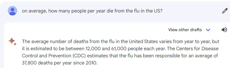
Denis Rancourt’s recent work (180 pages) shows that the vaccine kills about 1.2K people per 1M doses. “He found no evidence that the Covid-19 vaccine has reduced overall deaths in any of these countries. In fact, the opposite seems to be true.” There have been 650M doses in the US, which would imply 780K deaths which is close to my 650K death estimate. The number of COVID deaths in America is vastly over inflated. A recent JAMA paper showed COVID is about 2X deadlier than the flu, and since flu deaths per year average 37,800 (which I got from Bard so I can’t be accused of cherry picking the number), an estimate of actual COVID deaths over 3 years (since Omicron is very mild), we can estimate that around 226,800 people (37800×3 years ×2 the death rate) were actually killed by COVID, so 780K/226800 = 3.44 which is remarkably close to the 3.5X factor from our surveys.
More on bias
All surveys have bias.
In my case, there is a bias for lower numbers because my followers are very under vaccinated and in many cases, their families are too. So this can result in lower vaccine deaths.
But there might also be a bias in assessing a death to be from the vaccine when it wasn’t caused by the vaccine. Experts can adjudicate these deaths and we can apply a correction factor that might correct in either direction. Here’s the interesting thing about this bias: I don’t think anyone knows which direction this bias is! I don’t. Do you? Were my readers more astute than trained professionals in assessing vaccine deaths? Or less astute? We can adjust for this bias, but the problem will be: who do you trust to make the professional assessments of the death? Any medical expert I suggest who I think is astute can be accused of being biased. So the bias accusation can always be made.
The simplest approach is the Occam’s razor method and assume that the assessments are “close” and consider this as one experiment that generates a value.
Or we can invite our critics to show us their data that properly corrects for all these biases (as if that is possible).
Then you look at the other experiments and look at the values that they produce. If you have 9 values that all strongly agree and 1 that doesn’t, you then can spend more time on the outlier trying to find a source of error. Failing that, maybe it is the 9 that agree that have the error, but that’s less likely.
In my case the numbers lined up well… all the approaches showed that the vaccine killed more people than COVID and should be halted. The numbers I got in this survey didn’t surprise me, they didn’t surprise my colleagues, and the anecdotes are consistent with the numbers. I love anecdotes because you can verify all the facts whereas you cannot do that with government data (the UK data being the perfect example of totally useless and misleading data). For every person who claims “your survey is biased” I can say in response that “your government data is biased.”
Biases are a part of life. You try to adjust for them when you can do so accurately.
Why is nobody taking my $1M bet? Answer: Because none of them believe their bullshit claims about the vaccine being safe
I’ve offered to bet anyone in the world $1M who thinks that COVID has killed more than the vaccine. What I continue to not understand is why nobody wants to take my money if the case is so obvious that the vaccines have killed fewer people than COVID. The most I got is a $500K bet from one person in Israel. That’s it.
Is he the only guy in the entire world willing to bet me? How come Pfizer and Moderna aren’t taking my challenge? How come none of the experts aren’t raising the funds for this “no risk” opportunity?
The reason nobody will bet me is that they don’t want to lose their money. It’s OK if you lose your life taking their advice, but they are so unsure they are right, they won’t risk their own money on their beliefs. It’s really that simple. They say it, but they don’t believe it. It’s all “big hat, no cattle.”
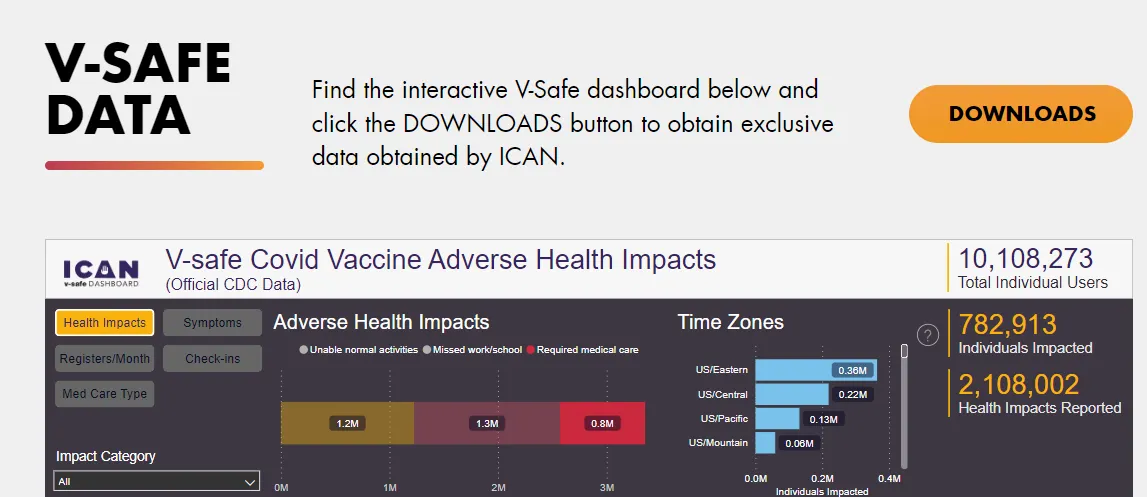
How about the seriously injured who required medical care? The estimate from that data is that over 2M people were killed by the COVID vaccine.
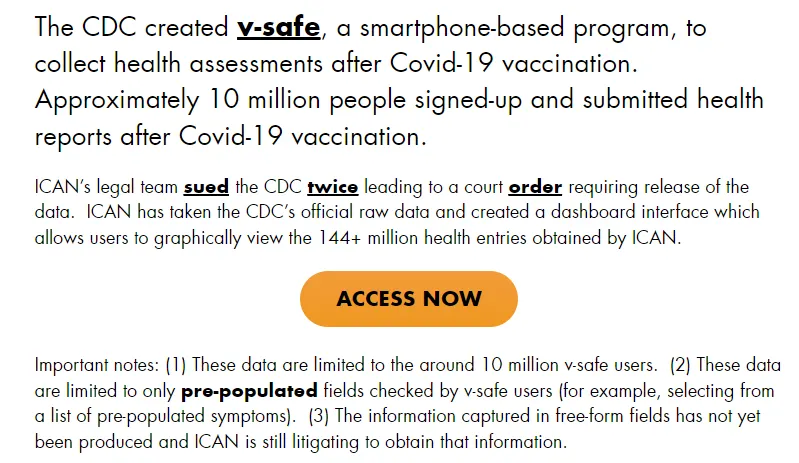
Here is the OFFICIAL CDC data. It took over 1 year of legal work before the CDC would release this. Why? Because the CDC doesn’t want you to learn the truth. They kept this hidden from view. Why? Because it shows the vaccine is a train wreck.
What they couldn’t measure is deaths because dead people don’t fill out polls!
But our survey showed (looking at the HOUSEHOLD data (where people would have first hand knowledge of serious injury), that there were 8X as many household serious vaccine injuries (requiring hospitalization) as vaccine deaths.
So let’s take the V-safe data, 783K * 25 is nearly 20M deaths. Now divide that by 10X (just to be very conservative) and you get 2M deaths from the COVID vaccine.
So once again, we showed that there were more deaths from the COVID vaccine than from COVID, using a very conservative analysis.
There is no survey data anywhere to dispute this because the authorities do not want you to know the survey data. It took over a year for ICAN to convince the CDC to release the data (basically the CDC was finally “convinced” they were wrong to keep the health data secret by two lawsuits and a court order to release the data). Even today, the CDC still refuses to release the free-form data. There is a reason for that. If the data showed the vaccine was safe, do you think the CDC would be withholding that? Of course not!!!! They’d be giving it to CNN to parrot every night. They’d be mandating that every person download it and read it.
So when the CDC doesn’t want to disclose public health data, you know it is really bad.
Summary
My latest survey shows 3.5X as many people were killed by the vaccine as by the virus. That is a train wreck.
Professor Norman Fenton was not at all surprised by this number based on his research. When I told him the number, he didn’t even raise an eyebrow.
In this article, I showed 5 entirely different methods for validating the results.
Not a single pro-vax person, as far as I know, has any clue as to what they think the number is. Whenever I ask, they throw up their hands and say that they don’t know. Even though they have no clue what the ratio is, there is one thing that they are absolutely confident of: I can’t be right and my survey MUST be wrong.
This reminds me of physicians who say, “We don’t know what killed you, but the one thing we do know for sure is that it wasn’t the vaccine.” Have you heard that before?
It’s time for the vaccine advocates to put up or shut up. Show me your numbers, show me at least 5 independent ways you got to the same number, and show me the similar extreme anecdotes showing that your number must be right and mine is wrong (like show me the guy who knows 30 people who died from COVID and only 1 person who died from the vaccine), and let’s get to the bottom of this and find out who is right and who is wrong.
Not showing up with any data or any willingness to resolve this issue is unacceptable.